 Here’s something I’ve been working on at placr:
>>>> placr.mobi <<<
[Update:placr.mobi is a bit different these days, but the tube stuff is actually available at http://placr.mobi/timetable?u=uk%2Ftube ]
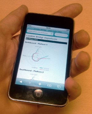
Have a play with it. The site is designed to work well on mobile screens. You can get to it by typing “tube-radar.com“. [update: These days that’s also something different. Sorry for the confusion]
The red and blue lines indicate tube performance in terms of “headway”. The time between trains. Closer to the centre means shorter headway (good!) further from the centre means… waiting around a while.
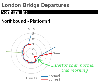
You can compare the data over the past 24 hours (red) with the “normal” levels (blue) which are averaged over a longer time period, but at the same platform and same time of day. Hopefully this will give an indication of how good or bad or erratic your service is likely to be today.
If you’ve chatted to me about what I’ve been doing at placr, you’ll have noticed I’m fairly hopeless at describing it. So hopefully this will give you a better idea, although this is only part of part of what I’ve been doing. We decided it was time to bring some stuff to the public-facing surface from one of our projects. We’ve spent a while gathering and analysing performance metrics of the tube, and this is one kind of output we’re seeing. To get this out in time for the tube strike was a bit of a last-minute rush, so it may look rough around some of the edges, but here’s hoping some people will find it useful (or at least interesting) over the period of the tube strike.