
I gave a talk at State Of the Map 2017, the official OpenStreetMap annual conference, which took place in Japan last month.
“The Diagrams of OpenStreetMap” is a tour of a various diagrams illustrating the project, but focussing more on my own diagramming efforts, including quite a few new diagrams I produced especially for this talk.
I would have mentioned in my talk, but I wasn’t going public with it at the time: I’m going to be available for new work opportunities soon. Maybe I can find something map related? We shall see (suggestions welcome). In any case I’ve been involved in OpenStreetMap, mostly as a volunteer, for over a decade now, and so I’m well placed to try to capture some “big picture” overviews of the project… in diagram form! That’s what I’ve tried to do here.
Watch the video on the conference site
Slides as a LibreOffice .odp file (7.3Mb)
But the following are slides and transcript as one big long blog post. In total there’s a whopping 61 slides (I was talking through them quite quickly). I’ve skipped over some animation step slides to reduce this down a bit, but still a lots of slides:
Jump to slide:
1, 2, 3, 4, 5, 6, 7, 8, 9, 10, 11, 12, 13, 14, 15, 16, 17, 18, 19, 20, 35, 36, 37, 38, 39, 40, 41, 42, 43, 44, 45, 46, 47, 48, 49, 50, 51, 52, 53, 54, 55, 56, 57, 58, 59, 60, 61
Slide 1
This talk is called “Diagrams of OpenStreetMap”. I started thinking about this after my previous 2014 State Of The Map talk.
Slide 2
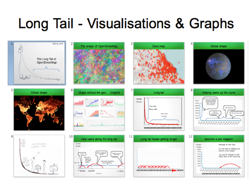
In Buenos Aires I ran through some favourite visualisations which in some way capture the essence of OpenStreetMap
Slide 3
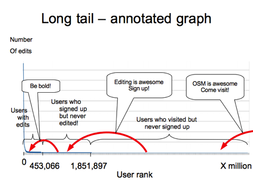
But I was mostly talking about the “long tail of OpenStreetMap”. The long tail graph shows a spike of a few big contributors on the left, and long tail of many people chipping in a little bit at the bottom.
I annotated this in various ways in that talk. I think this was my favourite. It’s showing the marketing messaging and really everything we do to make OpenStreetMap easier, which all can be related to different positions on the long tail graph.
We’re enticing a potential audience of many millions of people to come take a look at the website and find out about OpenStreetMap for the first time. Then enticing some of those millions to join the ranks of signed up users because you might want to edit… and then trying to entice those people to actually make an edit, since there are many signed up users who do not. So perhaps the message at that stage is to “be bold” and give editing a try.
I suppose it’s also showing that messaging for new joiners and website visitors, is very important in terms of number of people it applies to.
I like this kind of thing. A “big picture” diagram which tries to capture all of OpenStreetMap, or some aspect of it, explaining our project in a particular way.
Slide 4
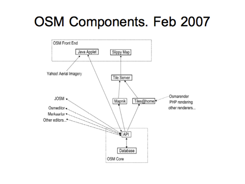
Big picture diagrams are something I’ve been trying to do for a long time now. One of my very early contributions to the project was this technical components diagram …a decade ago now!
Slide 5
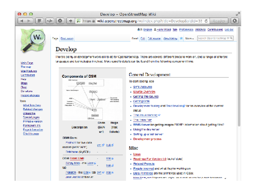
You may recognise it better if I show it like this. It was designed as a little illustration for the “develop” page on the wiki, where we listed various technical development activities. This page was fairly prominently linked and used to get a fair bit of attention, so it felt like an important diagram despite being pretty basic.
Slide 6
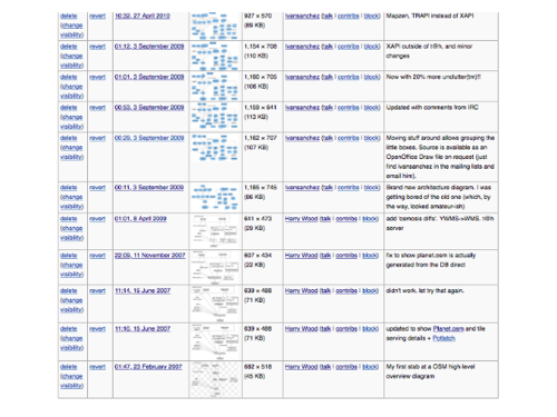
And this diagram went through a lot of different revisions, which you can see in the wiki history.
The way the diagram developed was actually kind of interesting. It represents some historical changes, but also an evolution of my own understanding.
Slide 7

It starts off with the “Java Applet” editor which feels like early history of the project now.
Slide 8
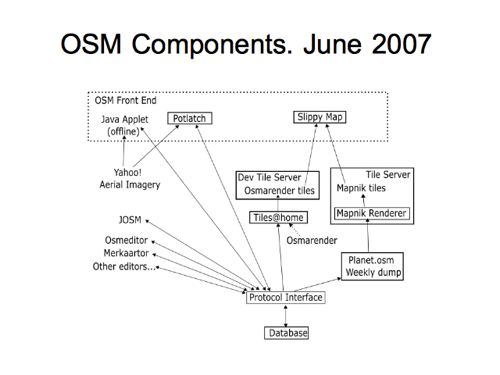
That was largely replaced by Potlatch in the next revision, and you can see I’m refining my understanding of how the tile rendering systems work.
We had a strange idea of calling the API the “Protocol Interface” at this stage, and you can see that I’ve incorrectly shown the “Planet.osm” feeding from the API. This is wrong…
Slide 9
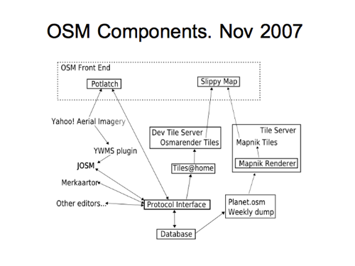
….but fixed in the next revision, in November that year.
We’re showing JOSM consuming Yahoo! Aerial imagery via the “YWMS Plugin”. Remember that? That was rubbish. This still feels like early history
Slide 10
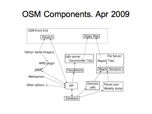
It went unedited for a while but here in 2009 I did another update. We’re calling it the “API” now and introducing the “diffs” alongside the planet dump.
So as I say, this was an evolution of my own understanding as much as anything. So a few people were involved in the sense that they were telling me the stupid things I was getting wrong, but… I was always hoping for some direct collaboration on this diagram, and later that year…
Slide 11
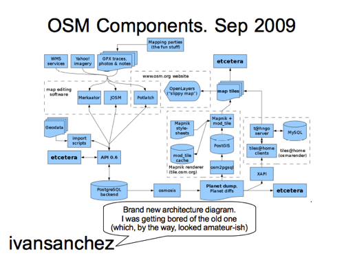
Boom! Collaboration!
Well sort of… ivansanchez redrew the whole diagram into this more spectacular creation, overwriting with the wiki comment (which you have to imagine spoken in Ivan’s cheeky spanish accent) :
“Brand new architecture diagram. I was getting bored of the old one (which by the way looked amateurish)”
Thanks ivan. Thank you very much! 😀
He was right though wasn’t he? It was pretty amateurish. This looks much more of a pro job
Although… it’s getting more complicated. Showing more components, which may or may not be regarded as a good thing.
Slide 12
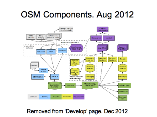
And the diagram continued from there through a few more iterations, with somebody else getting involved too to add some colours.
…up until this point in 2012. At this time it was removed from the “Develop” page on the wiki, and I think around the same time, the entire wiki was de-linked from the front page a bit, meaning this diagram no longer got much attention.
This seemed like a shame to me so…
Slide 13
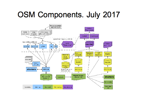
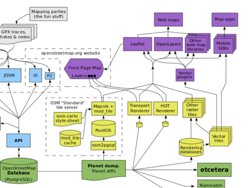
Especially for this talk I decided to blow the dust off it, and make some more changes.
Now first of all I actually largely re-created the diagram because Ivan only had OpenOffice files from an earlier version, so I’ve recreated this in Inkscape now, and got it working directly from SVG within the wiki. Rather a fiddly task actually, but I’m hoping this may encourage more people to make edits to it
I also made various obvious updates. So I’ve included ‘iD’ editor alongside ‘P2’ (I have to thank Richard here for choosing nice short names for editors. Made drawing this bit of the diagram much easier!) and I’ve added some mobile editors.
Slide 14
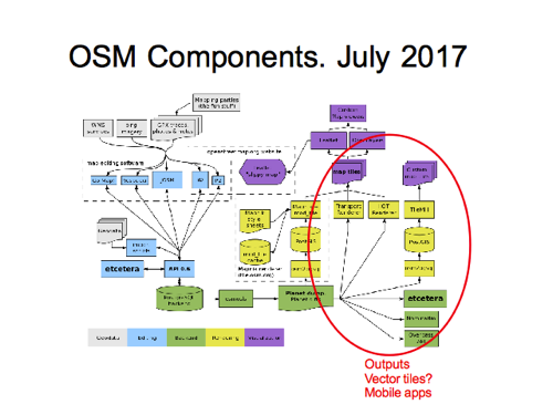
The right hand side shows some tile rendering systems. I got rid of MapQuest, and we’re showing just those which are featured on the main page here. We show Leaflet and OpenLayers options at the top.
But it feels like there’s a huge range of output possibilities not really covered by this.
Slide 15
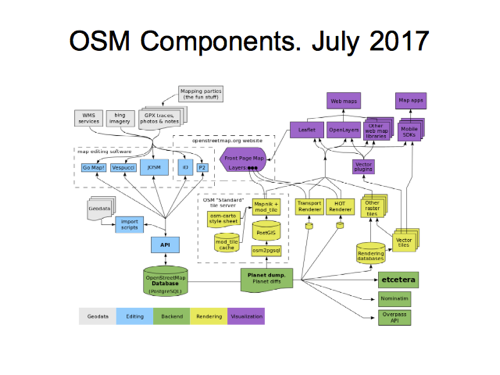
So I’ve done another iteration. This is the components diagram as it currently looks.
You may have seen my blog post about this. I’ve had a go at adding a bit more detail to the right hand side…
Slide 16
Near the top we’re now showing other web map libraries, and also mobile apps with web mapping app SDKs.
I’ve tried to introduce “vector tiles” here. We can feed vector tiles into a raster rendering system (e.g. as a Mapnik datasource), sending raster tiles to the browser as before, but these days we can also use “Vector Plugins” such as Mapbox GL JS / Tangram to render vector tile data in the browser. Likewise in the mobile SDKs.
I’m happy with this as as a conceptual summary diagram but vector tiles is a confusing array of different technologies on server-side and client-side, following different standards/schemas. I’m confused by this, so I’m probably the wrong person to try to draw such a diagram, but I think this is also a clue that this is an information gap, and a great diagram could help bring clarity to me and to lots of other people. So can we find a diagram to help with this?
Slide 17
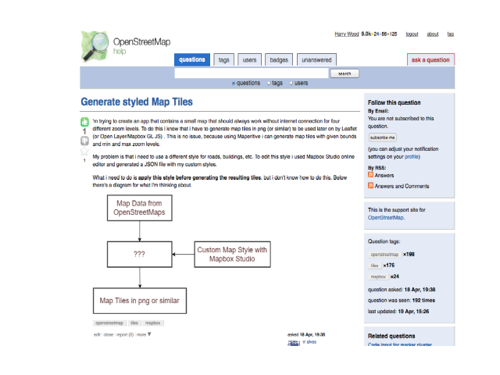
I found this diagram on the Q&A site which made me laugh.
Map data from OpenStreetMap(s!), a style definition, in the end map tiles, and …what is that ’???’ thing in the middle?
Not a very revealing diagram, but just look how much more interesting this question is when there’s a diagram added!
Slide 18
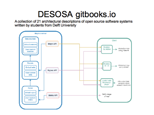
This diagram is probably the closest to what I’m looking for actually. I found this in the Delft Students on Software Architecture, so some sort of university project to document open source, with a chapter on Mapbox GL JS. We’ve got boxes for client and server side components and various mapbox technologies and APIs. I don’t understand some of the arrow directions here.
Slide 19

But what I’m looking for is a diagram with boxes and arrows for the range of different vector technologies from MapBox, Mapzen, OpenMapTiles, ThunderForest, Wikimedia, also the various client-side libraries, and laying out the different standards, and some indication of compatibility (the concept of vector tile “schema” and how that effects compatibility)
This is a sketch I drew while chatting with Matt in the pub, but when I got home I realised I didn’t understand it! Always the way.
Unless anyone can suggest an existing diagram, I hope to revisit this, and I hope to pick the brains of people at this conference to understand it better.
Slide 20
OK. Here’s another diagram I created quite a while ago. Actually I think I was regarding it as a successor to the component diagram for some purposes. It’s showing fewer technologies, just some key ones and broad concepts and trying to show an ecosystem of data users.
Actually I created this, not just as a diagram, but as a slide deck forming a kind of animation, introducing tech topics as the diagram builds up.
I’ve presented this four or five times now, to various technical/developer audiences, as an introduction to OpenStreetMap.
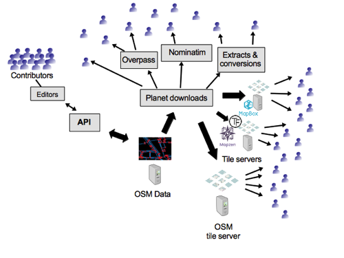
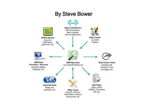
Slide 35
I found this diagram by Steve Bower which does a similar thing of placing the raw OpenStreetMap data at the centre of the diagram, with many arrows radiating out from it.
Slide 36
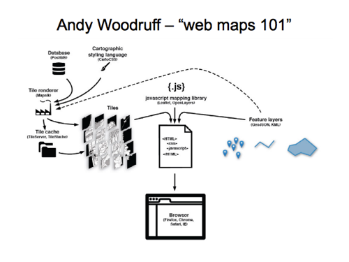
I like this diagram by Andy Woodruff from a web maps 101 maptime talk. That’s for a similar web developer type audience, and the diagram covers the tile server rendering bits.
I like the way it also has “feature layers” coming in on the right hand side. That’s the bit web developers tend to be more familiar with from using google maps (which offers less control of the left hand side)
Slide 37
Sticking with tech topics for a little longer…
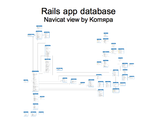
Here is a diagram by Komяpa showing the database of OpenStreetMap (website & API). Maybe this kind of thing is useful for developers?
At this zoom it might be better not listing out the fields and just show table names. But I showed this to some of the sysadmins and we played a game of “guess the database table”. The well linked table on the left with lots of fields is the ‘user’ table. The well linked table on the right is the ‘changesets’.
Slide 38
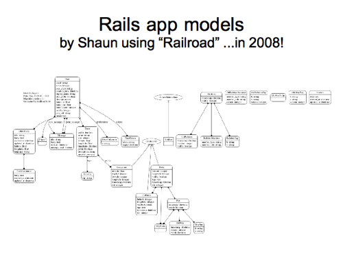
Here’s diagram showing the rails app “models”, which is more or less the same thing but a little different.
This is very old. Shaun did this in 2008, so maybe we should try re-running this “Railroad” tool to regenerate it now. The fact that this whole diagram is automatically generated, is kind of interesting.
Slide 39
Here’s something a bit different, but again automatically generated.
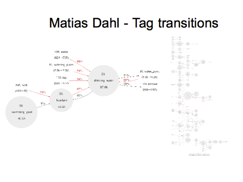
Matias Dahl made these diagrams which show tag transitions, meaning it’s tracking things which have changed from one tag to another, and looking at the statistical frequence of these transitions, which turns up some interesting linkages, showing that tags are related, but often confused, perhaps because they are very similar or overlapping in their definition.
These are all prefixed with the amenity key, so we can see in the example I’ve pulled out, that people commonly “fix” these various other values to become amenity=drinking_water . You can imagine people might accidentally tag something as amenity=fountain when they meant a drinking water fountain. So that’s just an example, but on the right is the really big diagram covering lots of interlinked amenity tags. And being an automated process, he could re-run it for other keys.
This is a neat use of the big “history dump”. He had to crunch all of that data rather than just the current “planet dump” in order to figure out these tag transitions.
Slide 40
OK. Something completely different now. We’ve been fairly techy so far, but how about this for a diagram?
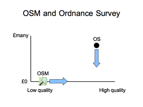
This is an old diagram which Steve Coast used to show, to explain the project in the early days. The idea is, as OSM quality improves at zero cost, moving along the bottom axis, we start to exert a downward pressure on the price point of traditionally licensed closed data providers, even if we haven’t yet reached their level of “quality”.
This is UK specific, talking about the Ordnance Survey, but you might be able to draw a similar diagram showing a monopolistic over-charging data supplier in your country.
…and actually the situation in the UK has changed now.
Slide 41
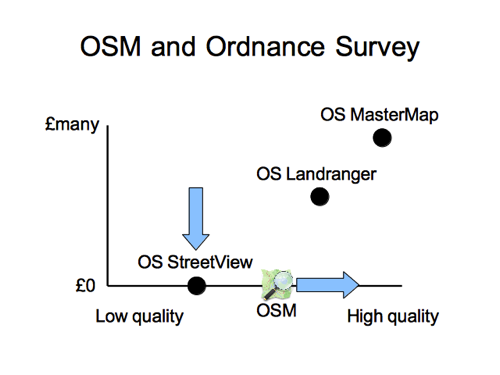
Ordnance Survey released some of their datasets as free open data, so we have to show this rather more complicated picture. Different products. Different price points. Debatable positions on the quality scale (depending on your use case)
I find it useful to show this, if only to point out that the Ordnance Survey have not released all of their products as open data (a common misconception)
Slide 42
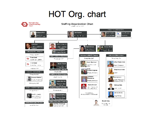
Here’s a different diagram. An “organisation chart” for HOT. These are the HOT paid employees. We can see their different teams.
I really like that we can see their mugshots. It feels softer, more human, and more real than just showing people’s names. It makes us feel we know each other better.
Slide 43
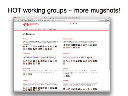
We also use mugshots on this page, which is showing HOT working groups. These are not staff but volunteers now. It could be interesting to blend the two diagrams somehow.
Slide 44
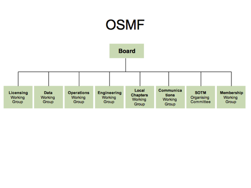
What about the OpenStreetMap Foundation? It only has one member of staff doing admin, so the staff org chart would be boring, but we do have a board and some working groups arranged like this I suppose.
Given that some working groups come and go and are more/less active, while others are like OWG and DWG are performing essential functions, it could be redrawn to show some being more important than others I suppose.
But there’s an obvious limitation/problem with this diagram, and with the previous HOT diagrams. They don’t show anything of the big OpenStreetMap community where a lot of the action is. Some “work” happens in things like working groups, and HOT paid staff positions, but vast amounts of “work” go into making OpenStreetMap great outside of these organisation structures.
Slide 45
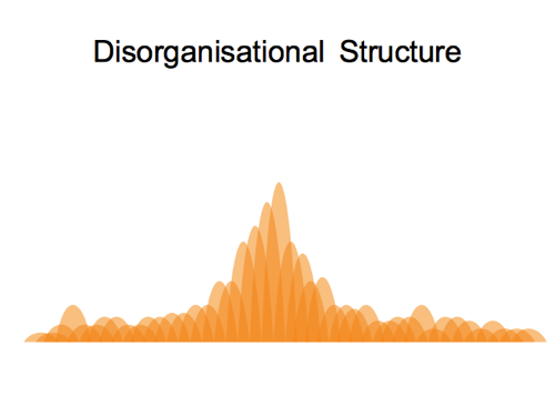
…in what we might call a “disorganisational structure” (to be a little flippant)
I have this vision of the OpenStreetMap community represented as a wibbly wobbly jelly blancmange thing. A big community of many volunteers working to build OpenStreetMap up into something great. Reaching upwards for the sky.
Slide 46
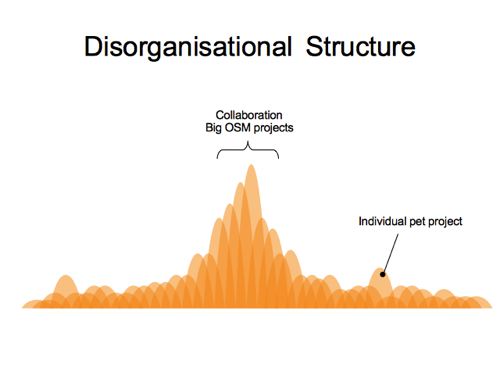
People make collaborative contributions, or individual contributions, sometimes as one-offs before disappearing again.
In the middle of the diagram we have folks working together, and managing to build on eachother’s work to some extent, for example with large important OSM projects like developing the core website & api, and JOSM / iD editors. Things like “Overpass API” also get subsumed into this central column of collaboration, with many people building upon it, and relying on it as a stable bit of infrastructure. But like many things it started life as more of an individual pet project. A great contribution (forming a tall blob on the diagram), coming from the community at large and gradually being drawn in as a more central thing.
This is not just about tech contributions though. It’s also people creating great documentation resources, or blogs, or building great local communities.
But a lot of volunteer effort comes and goes. Things get set up but then get shut down a while later. There’s a lot of ebb and flow. A wibbly wobbly jelly.
Slide 47
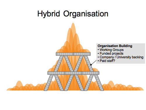
There’s various things which we might collectively call “Organisation building”, which I think of as attempts to build some solid structure. To make things less wibbly wobbly,
Things like working groups, things done as university projects, or even paying staff to do certain things. These are slightly boring classic organisation type things, which can feel quite different from our normal volunteer driven do-ocracy.
When I served on the board of HOT, we talked a lot about the challenges of building a “hybrid organisation”. This reinforced jelly diagram/metaphor popped into my head a lot. I think we should try to do organisation building activities in a way which is not working around or re-doing volunteer activities, but supporting them. Placing good solid cast iron girders for the community to climb upon, to bring OpenStreetMap to higher heights.
Slide 48
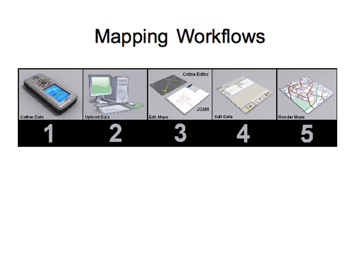
OK. Something different again.
Here’s a diagram which for a long time was shown on the first page of the wiki beginners guide. It shows the mapping workflow in 5 steps. Actually the whole wiki guide was structured around this. I think in a way that was quite good, because there’s many different ideas for ordering this guide. I think this diagram forced us to settle on one idea for the overall structure, partly because the graphics is quite nicely done, so nobody felt able to re-draw it!
But the five steps may seem a bit weird. If you’ve never used a GPS unit, you may be wondering why that is presented as the first step in the mapping workflow. Actually the 2nd step is also referring to uploading of GPS data, “upload data” being a confusing title. Likewise “edit maps” and “edit data” are confusing titles for steps 3 and 4. It means “edit nodes/ways” and “edit tags”. Those are OK as titles for chapters of the guide, but here it seems to suggest you do one then the other as separate steps. I suspect the step 5 “render maps” also dates from a time back when we needed to run our own data through osmarender and upload the image to the wiki, because there was no front page map! All said and done, there’s lots wrong with this diagram, but…
I’m interested in what we would replace it with nowadays. How do we capture the steps of mapping workflow in diagram form?
Slide 49
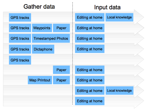
There are many different mapping workflows. In fact there always was, even back when it was all about using these GPS units. You could gather GPS tracks, giving you a spiderweb of lines along where the streets are, and then just name those streets etc from your local knowledge. But people have invented quite range of other ways to gather and record data. You could mess around with waypoints and write them down on paper. You could take photos and correlate them by timestamp (I used to do a lot of that). You could use a dictaphone.
Some folks would just dump their GPS tracks and never do any editing of map data.Now that would mean that you could build upon this by gathering data (using just paper) about street names or POIs and position that it in relation to other people’s GPS tracks. In theory you could even simply add roads over other people’s GPS tracks without even knowing the area (an early kind of armchair mapping) but I don’t think this was a common approach.
But of course we need to add aerial/satellite imagery to the picture here.
It’s worth noting, before I do that, that there are still some parts of the world where we don’t have useable imagery, so these workflows are still where it’s at.
Slide 50
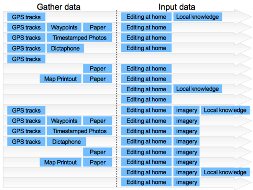
I’m trying to show all the different combinations of tools and data sources we might use, so if we add the use of aerial imagery as a possibility, then we get this combinatorial explosion in the number of different mapping workflows.The bottom half of this, is showing workflows now incorporating imagery.
But towards the bottom, some of these mapping workflows are made dramatically more viable when we have imagery. In particular, at the very bottom here, you can quite easily and effectively skip the data gathering stage entirely, and simply sit and home and edit the map based on what you see in the imagery. Armchair mapping!
Slide 51
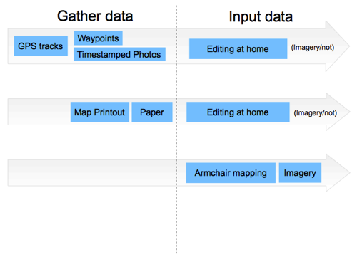
OK but these combinations are getting out of hand. Let’s condense this down. Imagery can be thought of as an optional source for use while we are inputting our data. If it’s available you’ll generally use it, even if you’ve got lots of GPS tracks and photos etc, so it’s almost not worth mentioning there. But obviously it enables this big new approach of armchair mapping at the bottom.
In the middle we’ve got paper based approaches. Map printouts like field papers, or just taking some notes on a piece of paper.
Slide 52
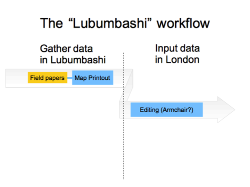
But while we’re on the topic of paper, I want to draw attention to what I call the “Lubumbashi Workflow”. As a humanitarian mapping thing, people in Lubumbashi in DRC, were asked to write down street names and other details on field papers map printouts. These sheets of paper were then brought back to mapathons in London (and Berlin too I think) and we inputted the map data there.
So this is a workflow involving two different sets of people. Because this editing is in an area we don’t know, maybe it’s a kind of armchair mapping (as humanitarian mapathons generally are) …but maybe not, because we’re taking this locally surveyed data, which is coming from the local community. We could think of it as a souped-up survey powered kind of armchair mapping.
I love the Lubumbashi workflow by the way. A great way to get low-tech local communities involved. The approach has been used several times since, and we should carry on with more of this!
Slide 53
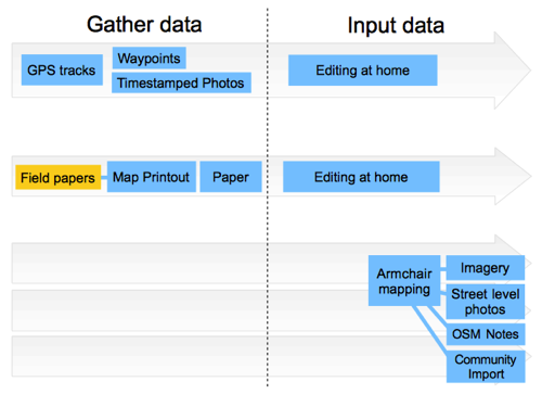
That’s not the only kind of souped-up survey powered armchair mapping actually. Connected to armchair mapping down in the bottom-right here, Street level photos from Mapillary and OpenStreetCam, and OSM Notes, when they are added by somebody else, can act as a new kind of data source for armchair mapping. Those new mapping workflows are a kind of enhanced armchair mapping, which feels closer to survey-based mapping.
Another box I’ll add here is “community import”. This is where we’re using an external datasource, and we copy data into OpenStreetMap bit-by-bit as armchair mappers. Like imagery though, we might have a dataset available as an optional source to make use of during any editing session. I’ll talk a bit more about importing in a minute.
Slide 54

I added field papers in yellow before, so let’s add a few more yellow boxes to this diagram for software/tools.
For armchair mapping we (sometimes) use tools which guide us on what to map. “Tasking Manager” is obviously one, but “Maproulette” also does this in a different way.
At the top in relation to “editing at home”, this is going to involve a desktop editor. JOSM and iD being the main options.
And aha! There’s a whole workflow style I didn’t mention yet.
Slide 55
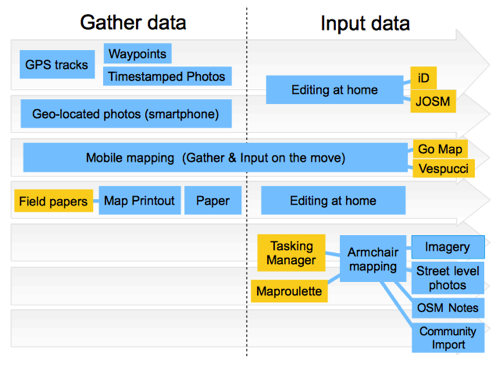
Mobile mapping! Mobile devices allow us a workflow which cuts through this divide between gathering data and inputting data. We do both at the same time, so a wide bar crossing both sides of the diagram. Typically that’s done with apps like Go Map!! on iPhone and Vespucci on android (There’s many other editor options of course. I’m just showing some leading examples)
Even when not using an app to input data, smartphones can make data gathering easer. In particular geo-located photos!
So I want to put this forward as a new diagram to show mapping workflows. As with many diagrams we have to choose how much detail to show. I like the balance I’ve chosen here. As I showed earlier, trying to show more data source combinations gets pretty messy.
Slide 56
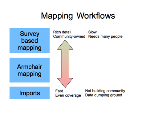
We could choose to condense it down more. We can group mapping workflows into survey-based mapping, armchair mapping, and imports.
I see these things on a spectrum. Survey mapping is rich and detailed and creates a dataset backed by a community of local mappers. At the other end of the spectrum, data imports will get mapping done very quickly, usually with even coverage. But (downsides) we’re blatting in data quickly, sometimes crudely, and side-stepping the community building problem. In the middle, armchair mapping e.g. with these big humanitarian tasking manager projects. It’s also blatting in data quite quickly, but at least at a human speed, using humans to use the OpenStreetMap editors, as part of, if not a local community, at least a community.
Slide 57
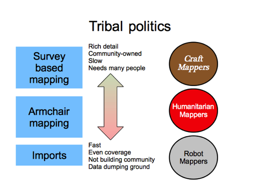
I probably just said something you disagree with, because I’m very much straying into a divisive area of OpenStreetMap politics now.
It’s a kind of tribal politics which Mike Migurski drew attention to, identifying groups he called “Craft Mappers”, “Humanitarian Mappers”, and “Robot Mappers”. He was discussing some particular debate related to robot mappers at the time, but I think it makes more sense to lump those in with a broader group of “Import” people. Anyway he labelled these groups and then…
…went on to conclude that “Craft Mappers” are all wrong and taking the project in a bad direction, which I disagree with pretty fundamentally.
Slide 58
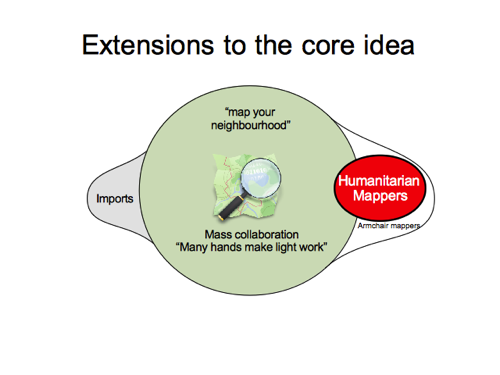
The idea of doing survey-based mapping, is not just some old idea we need to move on from. It’s core to what OpenStreetMap is. “Map your neighbourhood”, because if we all map our own neighbourhood and get enough people to do this, then we’ll have a free map of the world. Many hands make light work. A huge community of people coming together to create the map, and to maintain the map. It’s what makes OpenStreetMap unique. We’re not just an aggregation of data. Our map is created by a community. The data is backed by a community.
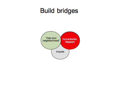
Imports, armchair mapping, and humanitarian mapping (which largely overlaps armchair mapping) are extensions to the core idea of OpenStreetMap. They should be carried out with due deference to the core idea of OpenStreetMap. This means finding ways to minimise anything which detracts or impedes the message and the practicalities of “map your neighbourhood” community growth.
Slide 59
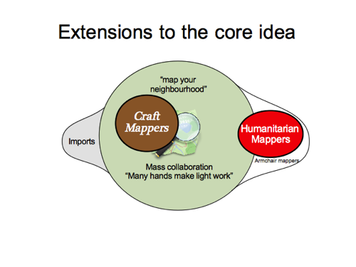
But I agree with one point Mike Migurski’s was making, that it feels like some unhealthy tribal politics has developed here. This “craft mapper” group of old timers are in danger of being seen as the “grumpy old farts” of OpenStreetMap, particularly if this group seems to be cliquey, unwelcoming and negative all the time.
But the “map your neighbourhood” message is a positive message, and a welcoming message. It’s all about welcoming more mappers to our community (but making sure we don’t do anything to inhibit that)
So to the craft mappers I want to say, let’s find ways to amplify that positive message. Less of the snide remarks in back-channels. Less of the polarised entrenched viewpoints. And let’s try not to be grinding on with negativity too much.
Slide 60
This will help us to become more unified and less tribal.
But if you are looking upon craft mappers as grumpy old farts, I would ask for your understanding. It’s not easy to defend these principles without sounding negative. Understand what OpenStreetMap is at its core. If you’ve only ever done humanitarian mapping, try mapping your neighbourhood just once. You might like it! Let’s keep refining the HOT validation process to help ensure we’re not blatting low quality data too quickly, and (In the developing world this is always going to be difficult but) wherever and however possible, let’s keep doing what we can to foster local communities and local mapping in addition to the armchair mapping.
If you’re keen on imports, understand that we don’t want OpenStreetMap to feel like a data dumping ground. Blatting in data could be detrimental to community-building; The “map your neighbourhood” thing we’re operating here. Again, understand what OpenStreetMap is. Follow the guidelines. Sell your import idea to the community, but dont get angry if our community doesn’t buy it.
Sometimes defending the core idea of OpenStreetMap can feel like an unavoidably negative discussion. Let’s look for ways to positively advise and reinforce the behaviour shifts we want to see from armchair mappers and importers. Set out rules, but also friendly guidance, and reminders of the reasons & the principles we’re defending. Find consensus on where we should draw the line. And let’s celebrate examples of where it’s done well.
Unify the tribes of OpenStreetMap!
Slide 61
…so we’re all in one happy OpenStreetMap family. Wouldn’t that be the best diagram of all? So I’ll leave you with that one. Thank you very much!
Jump to slide:
1, 2, 3, 4, 5, 6, 7, 8, 9, 10, 11, 12, 13, 14, 15, 16, 17, 18, 19, 20, 35, 36, 37, 38, 39, 40, 41, 42, 43, 44, 45, 46, 47, 48, 49, 50, 51, 52, 53, 54, 55, 56, 57, 58, 59, 60, 61
You can comment here, with any general thoughts, but this is a bit of a monster slide deck covering a lot of different topics. I’m very conscious I’ve glossed over some important details in trying to keep the transcript brief, so… I think what I’ll do (in the coming months) is post some of my diagrams more individually, probably as OpenStreetMap diary entries, and expand my thoughts about them a little bit. So that’ll make for a better place to have a focussed discussion.
Hi Harry. Can you share this slide with me? Thank you!
See the link at the top “Slides as a LibreOffice .odp file (7.3Mb)”. D’you need them in a different format?